

Furry Friends Rescue
Non-profit website redesign for a Bay Area pet rescue organization.
My Role
-
UX/UI Bootcamp group project
-
UX Researcher
-
Conducted user interviews, survey, contextual analysis, A/B testing, usability testing, card sorting, & competitor analysis
-
-
UX Designer
-
Wireframes
-
Lo-fi & High-Fi Prototypes
-
-
UX Copywriter
Time Frame
-
1 month
Timeline of Process
Empathize
Early Feb 2020
This project focuses on Furry Friends Rescue. My team and I decided we wanted to help this animal non-profit organization because all of their rescues live in foster homes instead of at a physical shelter.
As we tried to research them, it was extremely difficult to find out who they were. Their website did not showcase their unique mission and story. Only after meeting volunteers in person did we realize that Furry Friends Rescue is a Bay Area gem. We wanted people to get an emotional connection when they visited this organization's website, so they would feel inspired to get involved.
Problems
-
They have no physical shelter.
-
Urgency: The rescued animals are on Put to Sleep lists. Rescued animals quota is set by the number of available foster families.
-
Unclear mission & story on website.
-
Missed call-to-action opportunities.

Solutions
-
Strong storytelling and branding will create an enjoyable & emotional experience.
-
Clear call-to-action opportunities for users to get involved remotely:
-
Foster to Adopt
-
Donate
-

Current Furry Friends Rescue Usability Research Findings
I conducted four usability testing interviews with people that have either adopted from a pet rescue organization, are looking to adopt, or donate to/volunteer with a shelter. Due to time constraints, these participants were recruited from our team's personal social circles.
Interview Insights:

Contextual Inquiry
When my team initially reached out to the founder of Furry Friends Rescue, she was not interested in partnering with us. We, therefore, decided to attend an adoption showcase they were hosting at a local pet store.


During the contextual inquiry, we were able to gather testimonials from adopters, volunteers, and pet store staff. Everyone was extremely friendly and open to sharing their experiences with us.
Jr. Volunteer
Sr. Volunteer
Potential Adopter
I can't have dogs because my mom is scared, so I volunteer instead.
We need more help with finding foster homes for these pets.
Maybe that's how you know. You foster one and see how it goes. Without having the full commitment to have them the whole time.
Contextual Interview Insights:
-
Adopters:
-
wanted to meet the pets in person before adopting.
-
viewing the pets' stories - photos, history, age, breed, personality traits health - listed on the Furry Friends website motivated them to come to the event.
-
-
Volunteers shared:
-
that there was a Junior Volunteer program not listed on the website. The program's mission is to inspire youth to care for rescue animals.
-
the volunteer community's main methods of communication was via email and Google Groups. Whoever shows up to a volunteer event shows up.
-
website donations only covered food and medical care during the foster process. There was no funding for care during the adoption process, volunteer compensation, or administrative services.
-
that the owner was reluctant to redesigning the website since volunteers donated their time and efforts to upkeep the site
-
We concluded:
-
we would continue our design process and donate our findings
-
clearly sharing pets' poignant stories on the website was very important
-
motivating website users to adopt, donate, or volunteer should be the main call-to-actions
Survey
I created a survey using Google Forms and administered it through Amazon Mechanical Turk.
We received 85 responses of which 87% of them were pet owners. View our insights below.


These insights further cemented our decision to:
-
clearly share pets' poignant stories on the website
-
motivate website users to adopt, donate, or volunteer with clear main call-to-actions
Define & Ideate
Early Feb 2020
Using our survey and interview demographic data, we designed a future fur parent persona, Betsy Goodwin.

Betsy wants a pupper companion through a local animal rescue center, but she gets frustrated navigating all the different adoption websites. She wants to find an organization with a great mission - and of course does not want to support kill shelters. With Betsy in mind, we developed our problem statements.
Problem Statements
How might we improve the Furry Friends Rescue website so that
pet fosterers and adopters have a delightful experience throughout the entire pet adoption process based on an increase in pet adoptions?
How might we improve the Furry Friends Rescue website so that donors are successful based on an increase in donations?
Competitor Analysis &
Feature Prioritization Matrix
After researching six direct competitors and three indirect competitors, we chose to focus on the San Francisco SPCA for design inspiration.
They are the best known rescue organization in the Bay Area. We liked their consistent UI patterns and use of strong storytelling which can be seen through their consistent use of large banners and call to actions. We also liked that they have a live webcam to see the animals in their shelter.

Using our interview, survey, and competitor analysis data, we brainstormed solutions using digital stickies on Miro. We prioritized features using a matrix, deciding to focus on high priority, high impact features.

Key Features:
-
Branding & storytelling
-
Foster to adopt
-
Donations
-
Future goal: Volunteering opportunities
Value Proposition
Our empathize stage research showed that pets are viewed as family members, leading us to our value proposition.

Storyboard & User Journey Map
Before wireframing or prototyping could begin, we wanted to refocus on Betsy's experience adopting her furry friend.
Betsy's stress evaporates after learning about a foster event on the Furry Friends Rescue website. She also learns that there are foster options which allays her fears of long-term commitment, for now. A few weeks later, her foster Sprinkles has sweetened her life so much that Betsy adopts Sprinkles into her furever home.

Card Sorting & User Flow
During usability testing of the original Furry Friends website, site navigation was a major pain point. I wrote all navigation components from the original site onto index cards. We asked four people - and a special furry friend - to sort the cards. We used these insights to draft a site map. View the site map on Miro.

Using the site map, we drafted a task flow and then a full user flow. Our goal was to make all tasks as easy and stress free as possible by reducing the number of clicks and optimizing for a linear flow. We wanted to get people engaged quickly via donation, adoption, or foster. To reengage users after completion of their primary task, we suggested additional actions to take - like donating.

With our user flow completed, we were ready to help Betsy reach success! Next step, wireframes and and low fidelity prototype testing.
Paper & Lo-fi Prototypes
Mid Feb 2020
We generated two different mobile paper prototypes for A/B usability testing focusing on navigation and content to ensure users would have a clear call to action. We designed for mobile since the smaller screen size requires us to be even more concise and tap into users' mental models.
Our two respondents tested both A and B paper prototypes.

Key Insights:
-
Hamburger navigation was clear and easy to use
-
Users liked seeing pet pictures to get an emotional connection with them.
-
Finding an About Us section on prototype A was challenging. Prototype B showcases About Us section within the fold on the homepage.
-
One user wanted a search and filter function instead of clicking on each pet.
-
Donation button on prototype B was quick and easy to find. Users liked the ability to use Apple Pay or PayPal.
We took what worked well on each prototype based on user feedback and combined them into the lo-fi prototype.

Key Insights:
-
Mission and donation button were quick and easy to find.
-
Understanding types of fostering and how to foster are confusing.
-
Post-foster application next steps are not clear.
-
Users want to donate to a specific pet or via AmazonSmile and to know how their money will be used.
Test & Improve
Mid-Late Feb 2020
While I was testing prototypes, my teammate focused on our UI style guide and component library.
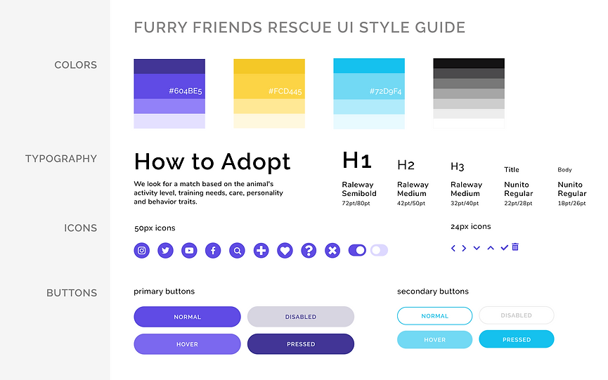

These were our design decisions:
-
Tone & voice: Playful and fun
-
Color choice:
-
Purple : Maintain the branding from the current Furry Friends Rescue website, but adjust to a more vibrant shade.
-
#604BE4 text on the light blue background (#E8FAFF) is WCAG AA compliant.
-
-
Light blue : Analog color to create harmony
-
Yellow : Complementary color adding contrast
-
-
Icons and buttons:
-
Rounded corners added to our playful and fun aesthetic
-
White text on the purple primary buttons are WCAG AA compliant.
-
The light blue and yellow are used predominantly as icons or as card background fill.
-
-
Typography:
-
Google WebFont is widely available and free via Open Source Licensing. Since we are designing for web use, we chose web fonts to reduce page loading times.
-
Raleway: The slightly less rounded, more geometric sans serif grabs your attention in headings - especially "w."
-
Nunito: The rounded terminal sans serif is perfect for paragraph copy on mobile and desktop.
-
-
Logo redesign:
-
We utilized the dog and cat to maintain branding from the current website.
-
The pets enclosed in the house symbolizes a furever home.
-
Since the logo UI pattern often leads to the home landing page, we maintained the bright purple we used in all primary buttons.
-
Armed with our lo-fi prototype usability testing insights, UI style guide, and UI components, we were ready to design our hi-fi prototype.
High Fidelity Desktop Prototype

Our high fidelity prototype includes the following solutions:
-
About Us section and banner on the homepage
-
Three major call to action buttons in the primary navigation
-
Branding and story telling via redesigned UI style guide and logo
-
Vibrant pet pictures organized on cards to get an emotional connection
-
Clear explanations of foster options
-
Pet search and filter function
-
Concise forms for foster and donation
-
Options to donate set amounts, sponsor a specific pet, or donate via a third-party organization like AmazonSmile
-
Progress bar and tool-tip copy describing how donations will be used during pet sponsorship
-
Post-foster and donation success copy signaling next steps
High Fidelity Responsive Prototype
We generated our hi-fi prototype in desktop first to make it responsive to mobile since current Furry Friend Rescue website is not responsive. We used a 12 column grid for desktop and a 2 column grid for mobile.

High Fidelity Usability Testing
I conducted one mobile and three desktop usability tests. These were conducted remotely via Zoom and Figma, and respondents were recruited through our social networks due to the quickly imposed California Shelter in Place ordinances.
Key Insights:
-
Desktop:
-
Found mission on home page and in the secondary navigation bar.
-
Users had to scroll to find Foster to Adopt below the other options
-
Users liked seeing pet pictures to get an emotional connection with them.
-
Pet filter and demographic tags on pet cards were not utilized.
-
Pet application form and donation flow are intuitive.
-
Post-application success copy was confusing.
-
-
Mobile:
-
Mission is clear on the home page.
-
The foster application form is not on the main Foster page. User was unsure if she can select or is given a foster dog.
-
Quick info and adorable pictures on each pet card is very helpful.
-
When applying to foster, adding additional pets is confusing since it is below the submit button.
-
We nailed it with rebranding and storytelling! Users positively commented on the animations, UI, and animal pictures. All respondents wanted to sponsor Winston since they felt sorry for him.

Next Steps:
Immediate Iterations
-
More usability testing
-
Include foster application on main Foster page, not just after user selects a pet
-
Quick view pop up box on pet profile during foster application
-
Reorder foster options, prioritizing Foster to Adopt above the fold
-
Better signify pet filter options and tags
-
Move additional pet cards in mobile application flow
-
Revise post-application success copy
Future Iterations
-
A/B test mobile navigation drop down menus
-
Volunteer & Adopt pages
-
More animation for loading screens